Case Note #001
Ink Over Glitter
By Salaar Khan
A modest paper, folded and stapled with code. A little vintage on the outside, a little modern under the hood.
Filed Report
The scene opens on a crowded boulevard of websites; flashing neon, spinning widgets, endless billboards. Everyone shouting, no one listening. I wasn’t interested in being another voice in the noise. I wanted something quieter. Something that felt like the folded corner paper waiting at the newsstand. Calm typography. Pages that trust words and structure. Ink instead of glitter.
Keep the page quiet.
Evidence: The Pressroom
The inspiration came out of fatigue. Scroll long enough and everything starts to look like the same startup brochure. I wanted a page that could grow like a column in a newspaper: clear type, simple hierarchy, no decoration that doesn’t earn its ink.

I built in the browser, no ceremony. The trick was to keep cutting. Every shiny piece I tried; gone. What stayed are the bones: speed, clarity, repeatable parts.
Evidence: Noir Ink
Light mode carried the print-paper vibe. Dark mode was trickier—so I staged something else: a torch. Switch it on and it follows the cursor, sometimes uncovering secrets in the margins 🤫.
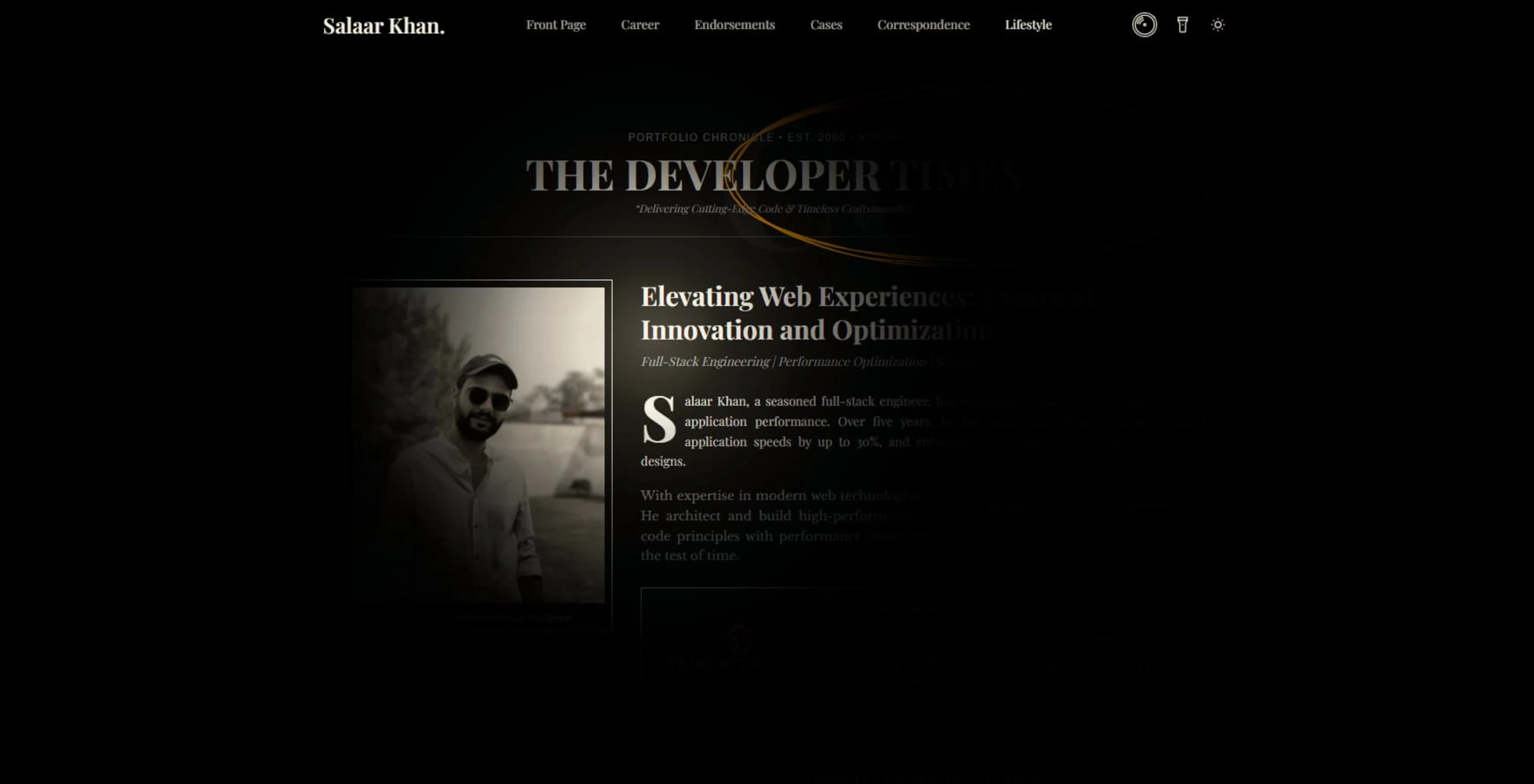
Paired with a low vinyl jazz hum, the page shifts into night press mode. News by day. Noir by night.
Findings
I’m no designer of record. I’m a developer who happens to like old paper, typewriters, and the way ink smudges on cheap newsprint. Those scraps of mood became raw material for code. The result? Simple, fast, a little rough by design. Better a page that breathes than one smothered in ornaments.
Closing Note
This is the first case in the file. Rough edges? Certainly. But every press needs its First Edition.
If you’ve read this far, I’d love your testimony leave a note in the endorsements section. Consider it evidence added to the case.